Why One McDonald’s Has Turquoise Arches! – Story of the Day
When most people think of McDonald’s, a golden “M” gleaming in the sunlight immediately comes to mind. It’s an icon recognized in nearly every corner of the globe—a symbol of fast food, convenience, and childhood nostalgia. But what if I told you that there’s a McDonald’s somewhere with turquoise arches instead of gold? That’s right—one of the most iconic brands in the world broke its own rule, and it’s not just a design quirk. Today, we’re diving into the story behind this unusual color choice, the fascinating history of McDonald’s branding, and what it all tells us about how companies respond to their communities.
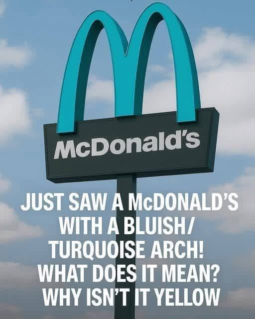
It all started when social media users began sharing photos of a McDonald’s in Sedona, Arizona, with arches that were distinctly turquoise instead of the familiar golden yellow. At first glance, it seemed like a quirky mistake. “Did they run out of yellow paint?” some joked online. But for locals and observant travelers, the color change had a deeper, more meaningful reason.
Sedona is famous for its stunning red rock formations and scenic landscapes. The city has strict building codes aimed at preserving its natural beauty. Buildings are required to use colors that blend harmoniously with the environment—no glaring neon yellows or stark whites allowed. In other words, this turquoise “M” is a clever compromise between the iconic McDonald’s brand and the city’s environmental standards.
A Brief History of McDonald’s Branding
To understand why turquoise is such a striking departure, we need to look at the history of the golden arches. McDonald’s first introduced the arch-shaped logo in 1961, inspired by the architecture of early McDonald’s restaurants. Over the decades, the golden “M” became more than just a logo—it became a global cultural icon.
The choice of yellow was deliberate. Psychologists and marketers note that yellow evokes happiness, energy, and appetite, while red stimulates hunger and urgency. Together, the red-and-yellow combination has become synonymous with fast food.
So when you see turquoise instead of gold, it’s not just a different shade—it’s a radical break from decades of marketing psychology.
Why Turquoise? More Than Just Aesthetic Appeal
In Sedona, every building must respect the natural color palette of the region. The turquoise hue was chosen because it blends with the earthy reds and natural greens of the landscape, offering a subtle nod to the golden arches while keeping the restaurant visually unobtrusive.
Community and Corporate Compromise
The turquoise arches also reflect a larger trend: the tension between corporate branding and community standards. Sedona isn’t the only city in the U.S. that enforces strict building codes; many historic or scenic towns have similar rules. In these cases, large corporations must negotiate compromises to operate while respecting the city’s character.
McDonald’s decision to adopt turquoise in Sedona shows a willingness to prioritize community values over strict brand uniformity. It’s a small change, but symbolically, it’s huge. It demonstrates that even a global brand can be flexible when it comes to sustainability, local culture, and aesthetics.
Reactions and Media Buzz
When photos of the turquoise McDonald’s started circulating online, reactions were mixed. Some purists were shocked: “How can it even be McDonald’s without the golden arches?” Others applauded the company for respecting Sedona’s landscape. Travel bloggers, photographers, and social media influencers flocked to the location, turning it into a minor tourist attraction.
Interestingly, this unusual branding move may have been a marketing boon rather than a hindrance. People love unique, Instagram-worthy locations, and the turquoise arches created just that—without McDonald’s spending a dime on a viral campaign.
Lessons from the Turquoise McDonald’s
Global brands must adapt locally: Even the most recognizable companies aren’t immune to local regulations and cultural expectations.
Aesthetic compromise can enhance brand perception: Respecting local values can earn a company goodwill and positive media coverage.
Marketing isn’t just about logos: Sometimes, deviation from the norm creates more buzz than uniformity ever could.
Sustainability and environmental sensitivity matter: By blending with the natural surroundings, McDonald’s demonstrates subtle environmental awareness.
In short, this tiny adjustment tells a story far bigger than just a color change—it’s about community, culture, and creativity within global commerce.
Other Unusual McDonald’s Around the World
Sedona isn’t the only place where McDonald’s has strayed from the standard red and yellow palette. Around the globe, you’ll find:
India: Many outlets remove beef entirely and feature vegetarian-friendly designs.
France: Some McDonald’s restaurants feature wooden exteriors and chic interiors to fit the local cafe culture.
Japan: Limited-edition seasonal colors for certain campaigns.
Each of these examples shows that even one of the most standardized brands in the world can embrace local culture without losing identity.
A Personal Reflection
Visiting the turquoise McDonald’s is an unexpectedly moving experience. As you walk up to the door, the iconic golden arches are nowhere in sight—replaced by soft turquoise that seems to echo the mountains in the distance. It’s a reminder that even global corporations can listen, respect, and adapt to local communities.
For me, it’s also a metaphor. Life, like business, isn’t always about sticking rigidly to a brand or plan. Sometimes, subtle adjustments can make the biggest impact.
The Bigger Picture: Branding and Flexibility
The turquoise arches also raise questions about brand identity. How much can a company change before it loses its essence? In this case, McDonald’s proved that a minor visual tweak doesn’t dilute the brand—it reinforces it, because the brand isn’t just a logo; it’s a promise of familiarity, taste, and service.
Continue reading…
