Why One McDonald’s Has Turquoise Arches!
Story of the Day
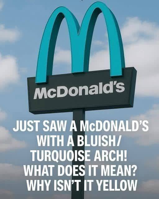
If you think you know what every McDonald’s looks like, think again.
Instead, this McDonald’s wears turquoise arches—cool, subtle, and almost… classy.
It looks less like a fast-food giant and more like a building that belongs exactly where it is.
So why does this one McDonald’s look so different?
How did one small town convince a global corporation to bend its branding rules?
And what does this turquoise “M” tell us about design, culture, and the power of local identity?
This is the story behind the most unusual McDonald’s in the world.
The Golden Arches: A Global Symbol
Before we talk about turquoise arches, we need to understand how big a deal it is that they exist at all.
The Golden Arches are one of the most recognized symbols on Earth. They are more recognizable than many national flags and religious icons. According to branding studies, the McDonald’s logo is recognized by over 90% of people worldwide.
Those arches aren’t just decoration. They represent:
Familiarity
Predictability
Corporate identity
Whether you’re in Tokyo, Paris, Cape Town, or New York, a McDonald’s usually looks… like a McDonald’s. Same colors. Same fonts. Same visual language.
That consistency is deliberate. McDonald’s spends billions ensuring their brand feels the same everywhere.
Which makes one question impossible to ignore:
Why would they ever allow turquoise arches?
The answer lies in a place that couldn’t be more different from the average highway McDonald’s.
Sedona, Arizona is famous for:
Towering red sandstone formations
Desert landscapes that glow at sunset
Spiritual retreats and energy vortexes
Strict environmental and aesthetic regulations
Sedona isn’t just a town—it’s a visual experience. Every building is meant to blend into the surrounding red rocks and desert tones.
Bright neon signs?
Loud colors?
Corporate eyesores?
Not welcome here.
Sedona has spent decades protecting its natural beauty, carefully controlling how buildings look so the landscape remains the star.
And when McDonald’s wanted to open a location there in the early 1990s, they ran into a problem.
Sedona vs. The Golden Arches
When McDonald’s submitted their original building plans, they included what they always include: bold yellow arches.
Sedona officials said no.
Not “maybe.”
Not “let’s negotiate.”
Just no.
The town’s planning commission argued that bright yellow arches would clash with the red rock scenery and violate local design standards meant to preserve Sedona’s visual harmony.
For McDonald’s, this was unprecedented.
Their logo color was practically sacred.
But Sedona wasn’t budging.
And here’s the surprising part: McDonald’s didn’t walk away.
The Compromise That Made History
After negotiations, McDonald’s agreed to a compromise that would make branding history.
Instead of yellow arches, the Sedona McDonald’s would feature turquoise arches—a color chosen because:
It blends with desert skies
It complements red rock tones
It reflects regional Southwestern aesthetics
The building itself would also follow Sedona’s strict design rules, using muted earth tones instead of McDonald’s typical red-and-yellow palette.
When the restaurant opened in 1993, it instantly became famous.
Not for burgers.
Not for fries.
But for daring to look different.
Why Turquoise?
Turquoise isn’t just a random color choice.
In the American Southwest, turquoise has deep cultural and historical significance. Indigenous cultures have used turquoise for centuries in jewelry, art, and ceremonial objects. It symbolizes:
Protection
Healing
Connection to the sky and earth
By choosing turquoise, McDonald’s didn’t just avoid clashing with the environment—it unintentionally tapped into regional identity.
The result? A McDonald’s that feels like it belongs there.
The Only One of Its Kind (Almost)
For years, the Sedona McDonald’s was the only location in the world with non-golden arches.
That exclusivity turned it into a tourist attraction.
People stopped not just to eat, but to take photos:
“The McDonald’s with blue arches!”
“The most beautiful McDonald’s ever!”
“The only McDonald’s that doesn’t scream fast food!”
Eventually, a few other locations around the world were allowed slight modifications due to local regulations—but Sedona’s remains the most famous and most striking.
It’s still one of the only McDonald’s where the arches are fully turquoise instead of yellow.
What This Says About Corporate Power
At first glance, this story feels like a quirky design anecdote.
But underneath it is something bigger.
McDonald’s is one of the largest corporations on Earth. When they enter a city, they usually change the landscape—not the other way around.
Sedona flipped that script.
The town proved that:
Local governments still have power
Communities can protect their identity
Even global giants must sometimes adapt
This McDonald’s exists because a town said, “Respect where you are.”
And McDonald’s listened.
Branding vs. Place
Branding experts often point to the Sedona McDonald’s as a case study in context-aware design.
Strong branding isn’t just about consistency—it’s about relevance.
In Sedona:
Yellow would have screamed “outsider”
Turquoise whispered “local”
Ironically, by breaking their own branding rules, McDonald’s created one of their most memorable locations ever.
People don’t remember another identical roadside McDonald’s.
They remember the turquoise one.
The Internet’s Favorite McDonald’s
In the age of Instagram and travel blogs, the Sedona McDonald’s has achieved cult status.
Search for it online and you’ll find:
Travel vlog features
Instagram posts with thousands of likes
Lists like “The Coolest McDonald’s in the World”
Architecture and branding think-pieces
It’s been photographed at sunrise, sunset, and under star-filled desert skies.
Not bad for a fast-food restaurant.
Does the Food Taste Different?
No.
The fries are the same.
The burgers are the same.
The McFlurries still break.
But somehow, eating under turquoise arches feels different.
Context changes experience. And Sedona proves that environment matters—even when you’re eating a Big Mac.
Why McDonald’s Doesn’t Do This Everywhere
So why don’t we see turquoise arches in more places?
Because part of McDonald’s power comes from uniformity. When you’re hungry on a road trip, spotting those golden arches from a mile away is comforting. You know exactly what you’re getting.
Sedona is the exception, not the rule.
It worked because:
The town had strict regulations
The location was visually sensitive
McDonald’s saw long-term value
In most cities, the corporate formula still wins.
A Quiet Lesson in Respect
The turquoise arches aren’t loud. They don’t glow aggressively against the desert night.
They sit there calmly, almost humbly.
And that’s what makes them special.
This McDonald’s teaches an unexpected lesson:
Global brands don’t have to erase local identity
Continue reading…
